Best Illustration of Bull & Bear Markets
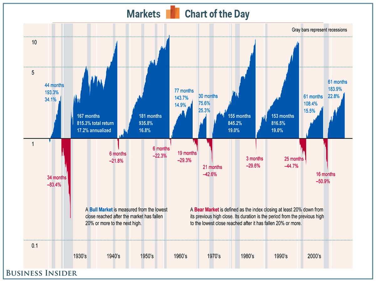 This is the best illustration we’ve ever seen of history’s bull and bear markets. Blue illustrates past bull markets’ durations and returns (total and annualized). Red illustrates the bear markets. This was published in May 2014 so the current bull market is actually pushing 69 months.
Some key takeaways:
- There’s a lot more blue than red meaning stocks tend to spend more time going up in value than going down.
- The current bull market might feel long but by historical standards, the length and strength of this bull is not exceptional
Source: BI