3-D View of the Yield Curve
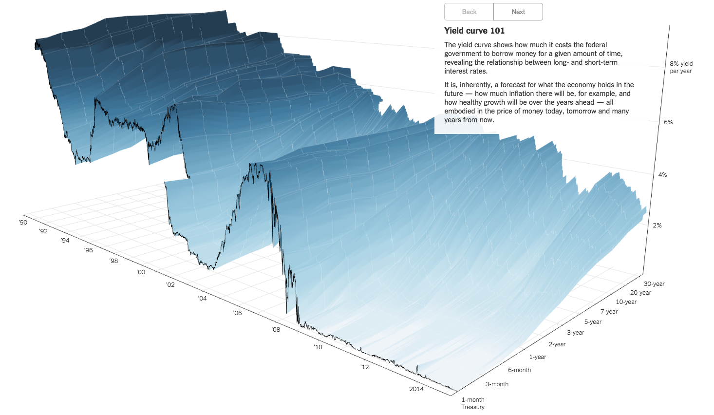
Here’s an awesome graphic from the New York Times showing the yield curve in three dimensions (time, duration, yield). The yield curve shows how much its costs the federal government to borrow money for a given amount of time, revealing the relationship between long- and short- term interest rates.
Visit the NYT website to continue the 3D exploration.