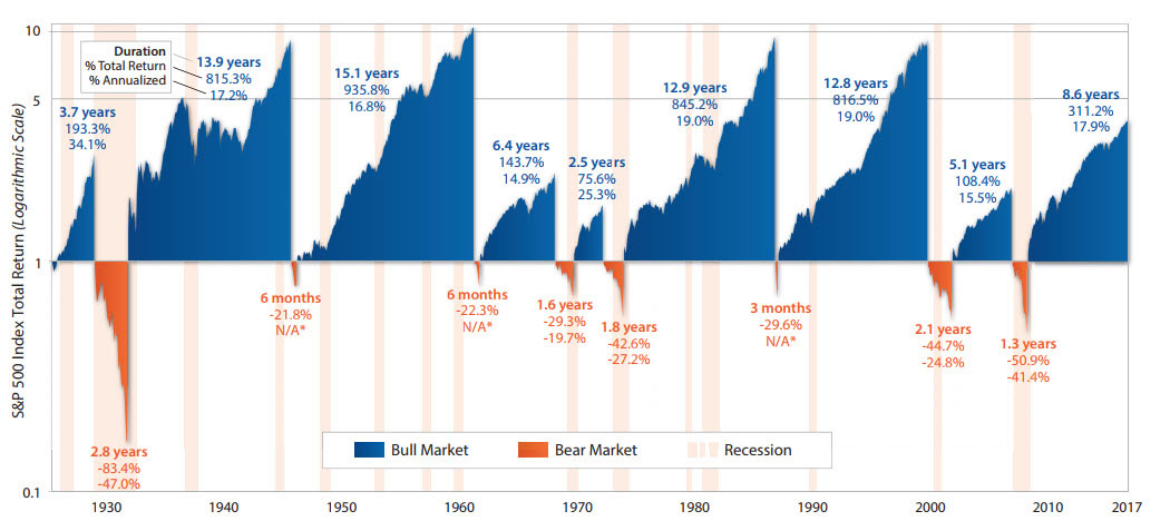
Best Illustration of Bull & Bear Markets
 Here’s the best illustration we’ve ever seen of history’s bull and bear markets. This chart shows the performance of the S&P 500 Index from 1926 through September 2017. Blue denotes past bull markets’ durations and returns (total and annualized). Orange denotes the bear markets. The pink vertical bars delineate recessions.
At a 100,000-ft level, this chart underscores the benefits of investing for the long-term. Two specific takeaways:
- There’s a lot more blue than orange meaning stocks tend to spend more time going up in value than going down.
- The current bull market might feel long, but by historical standards, the length and strength of this bull is not exceptional
Source: First Trust


