Looking for a Lucrative Major?
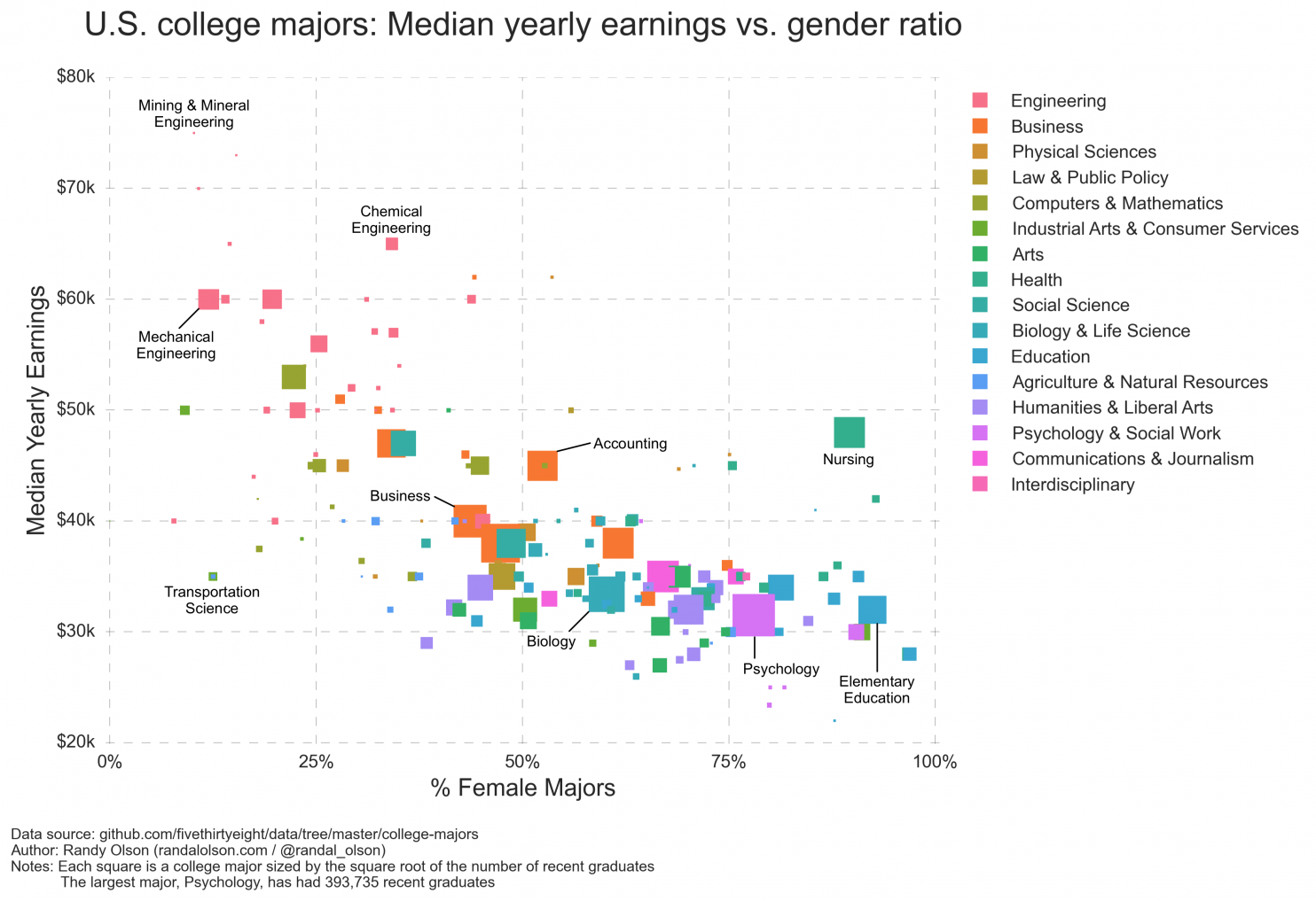
The chart below illustrates how gender, major and earnings are related based on an analysis of college majors and median earnings after graduation for those under 28. Median yearly earnings are shown on the vertical axis: Majors that appear toward the top of the chart tend to earn more, and those toward the bottom earn less. The gender makeup of the major is on the horizontal axis, with majors that are male dominated on the left and female-dominated majors on the right.
The chart clearly shows that those who study male-dominated majors generally earn more after college than those who study majors that are dominated by women. Each of the squares below represents a college major; the bigger the square, the greater the number of recent graduates. The color of the square indicates the category of study — science, humanities, etc.
Source: WonkBlog